Photo
Contrast

Coming to Microsoft
Office Picture Manager, one opens the file and clicks edit…, then clicks the Brightness
and Contrast and is ready to edit the photo for increasing or reducing
contrast. If MOPM is default photo editor, double clicking on photo will also
open the window for photo editing. A few frames are added for demonstration
purpose.

Frame 2

By increasing contrast by 30 or + 30 on contrast scale, the
shaded areas become more dark compared to well lit areas and enhances it.


The same photo is given a reduction of 20 points or – 20 on
contrast scale. The photo does not lose much of sky color but the shaded areas
are less dark or more lit offering less contrast to the overall picture.

Frame 4


On the brightness scale a 10 points increase or + 10 results
in the eye details becoming clear.


On the brightness scale a 20 points increase or + 20 results
in the blue tone to be realistic as it was visible through naked eye.

A photo may be over-exposed, so it looks flat and color
looks diluted. In such instances decrease in brightness does help.

On the brightness scale a 10 points decrease or - 10 results
in the blue tone of water and sky to be realistic. The foliage tone looks a lot
richer.

Frame 4

To make the flowers stand out better, in a darker
background, a reduction in brightness is called for. On brightness scale a 20
points reduction or – 20 results a darker background tone as desired.

A note of caution: In playing with Brightness
for photo editing, there will be instances when some details would be looking
un-natural or some details may get lost. One needs to decide his own priority
while achieving the final result of the photo.
The terminology contrast has altogether different meaning in
black and white photography and color photography. In black and white
photography, the various elements in the picture have different shades of gray
in black to white scale. A maximum contrast can be obviously between an element
having a black tone and another having white one. There will be many
combinations in between. This is also called tonal contrast.
In color photography, color contrast is due to opposite
characteristics of color (warm and cool) in main elements of the photo.
Generally speaking colors like red, yellow and orange are considered warm
colors whereas blue, cyan and green are considered cool colors. A cool color
accentuates the warm color and vice versa. The cool colors gives a feeling of
receding and warm color gives the feeling of approaching when referring to the
photo elements. Nature abounds in cool colors comprised of blue sky, the green
foliage, the gray rock and hence serve as best back drops in any frame. In
context of the photo editor, the measure of photo contrast means, the
difference of brightness between darkest (shadows) and highlight (well lit
)areas.

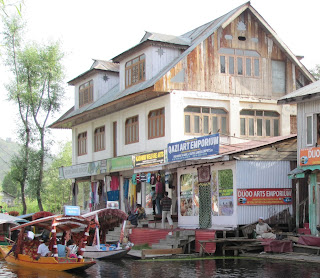
Frame 1
In this frame a shot from a shikara in Dal lake shows a
wooden building with shops on ground floor. The wood texture of upper floors looks
flat and the shop signboard letters do not look crisp.

An increase of 40 points or + 40 on contrast scale makes the
photo looks much better in terms of color tones. The letters on the signboard
looks crisp and clear.

Following is a photo taken from a resort in Patal
Bhuvaneshwar, Uttarakahnd. There is not much difference of contrast between
shaded areas and sunlit areas.


Frame 3
A typical shot of a Leh Palace with cluster of dwellings
around it, offers a lot of dark shaded areas. In the bright sunlight, the photo
contrast is high.


Following is temple view at Auli, Uttarakhand. The photo
being shot diagonally against the light, the temple wall in the frame is in shade.
The details of windows are not clear.

After decreasing contrast by 20 points or –20 in photo
editor contrast scale, the wall details including windows are clearer as shown
below.

A note of caution: Both the process of
increasing or decreasing contrast has to be done carefully to meet the
objectives of the photographer. Giving more contrast may render more dark spots
and on the other hand less contrast may mean the photo looks flat.
Photo
Brightness
Some photos require photo editing like increasing or
reducing brightness.

As usual one opens the Microsoft Office Picture Manager
or any other photo editor. One can double click on the photo to be edited or
import it separately into the editor frame. On top menu click editing…,
a side menu appears. Click on Brightness and Contrast. Two scales
appear, one for brightness and another for contrast. One can move the cursor on
plus side or minus side on brightness scale for the desired result. For finer
corrections, one can use up and down arrows, which give numbers for brightness
comparison. Some demo frames are added as follows.
A photo may be under-exposed so overall the photo appears
darker. In some photos the color tones will be looking garish. In such
instances increase in brightness
does help.
Frame 1
This frame shows portrait of a Langur. If one sees carefully
the details of the right eye of the animal is not clear.


Frame 2
The following photo of Pangong Tso lake at Ladakh looks
un-natural and garish because of very deep blue tone on water and sky due to
under-exposure.


Frame 3
The following frame captures a landscape at Ladakh, the sky,
water and foliage color tones appear to be diluted due to slight over-exposure.


Following frame shows wild flowers shot at Binsar, in a
diagonal composition with a dark grey background.


Over-doing the exercise of increasing or
decreasing brightness may result in an edited image far inferior to the
original.
………………………………………………………………………………………
No comments:
Post a Comment